Spatial Reasoning: The American Artistic Revolution of the 1960s and 1970s (extracts)
by Katharine J. Wright
IN DAYLIGHT OR COOL WHITE.” AN AUTOBIOGRAPHICAL SKETCH (extracts)
by Dan Flavin
Sol Lewitt Interview (extracts)
by Saul Ostrow
Dibujos sobre pared (wall drawings)
por Sol Lewitt
Sentences on Conceptual Art
by Sol Lewitt
Bruce Nauman Interview (extracts)
by Willoughby Sharp
Dan Graham Interview (extracts)
by Mike Metz
Minimalismo en traducción
por Aimé Iglesias Lukin
Spatial Reasoning: The American Artistic Revolution of the 1960s and 1970s (extracts)
by Katharine J. Wright
[1]Susan Sontag, “Against Interpretation,” in Against Interpretation and Other Essays(New York: Picador, 2001), 13-14.
[…]
Minimalism, Post-Minimaisml and Conceptualism centers on key figures of the American art scene during what is arguably its most fertile creative period: the 1960s and 1970s. Featuring iconic works by five seminal artists—Sol LeWitt, Dan Flavin, Fred Sandback, Dan Graham and Bruce Nauman—this exhibition introduces Argentinian audiences to the movements of Minimalism, Conceptualism and Post-Minimalism. Although artwork from each of these rubrics can vary widely in intent and form—presenting as anything from a steel cube to a signed document to a grainy video—they share vital tenets that reward consideration in concert. Consequently, this essay not only contextualized the artwork on view in Spatial Reasoning, but also broadly examines the rich nexuses shared by the Minimal, Conceptual and Post-Minimal art movements. In so doing, it aims to foster greater insight into one of the prevailing concerns of the ‘60s, ‘70s and, indeed, today: where does art end and life begin?
THE MYTH OF MINIMALISM
Artist and writer David Batchelor began his 1997 treatise on Minimal Art with a bold pronouncement: “There is a problem with Minimal Art: it never existed.”[1]In truth, the movement that we now refer to as ‘Minimalism’ existed in so many permutations and was exemplified by so many practitioners that its tenability as a cohesive practice was, at the time, quite in doubt. Although throughout history critics have been accused of taking liberties with ex post facto designations, the Minimal Art moniker was particularly combated.[2]While the “Minimal” aesthetic began to emerge in modernist architecture and literature as early as the 1940s—think of Ludwig Mies van der Rohe’s famous 1947 bon mot “Less is more”—the foundational connection to fine art was not made until 1965 when philosopher Richard Wollheim wrote the aptly titled essay “Minimal Art” for Arts Magazine. Focusing on twenty-first-century works with “minimal art-content,” Wollheim’s article discussed everything from Marcel Duchamp’s readymades to Ad Reinhardt’s black canvases, noting a shared absence of the artist’s hand throughout each final creative product.[3]In connecting Minimalism to authorial neutrality Wollheim pinpointed a core conceit of Minimal Art as we know it today; unfortunately, what he failed to do was apply that logic to any of the movement’s eventual canonical figures, omitting mention of Richard Serra, Robert Morris, Donald Judd, Dan Flavin or Sol LeWitt.[4]
Even the term “Minimal” was not fully ratified until later. Mirroring the diversity of the art itself, a panoply of alternative terms were proffered by critics throughout the 1960s, including ABC Art, Reductive Art, Cool Art, Rejective Art, Anti-Illusionism, Art of the Real, and Literalist Art.[5]Unsurprisingly, despite the supposed simplicity of the work at hand, scholars struggled to come to a consensus about what specificallyMinimal Art was or did. The only defining characteristic of the ‘movement’ seemed to be that there were few definite characteristics. At best, the majority of critics could agree that, unlike most of the movements in American art history, Minimal Art was mainly three-dimensional, if not quite ‘sculptural’ in the traditional sense.Consequently, works falling under the Minimalist purview tended to share an affective sensibility as opposed to an aesthetic taxonomy; one could recognize them less by their material properties (though industrial materials were often a strong clue) than by the presence they maintained in the gallery and the reactions they produced.[6]
[…]
Wielding the pen like a sword, these artists sought to remediate what they believed to be a gross miscarriage of terminology: the “Minimal” denomination. In a 1969 interview Fred Sandback explained: “Minimal art—that’s just a term, and for me it’s inappropriate as an expression. You could just as easily speak of Maximal Art. Light, space, facts are involved.”[7]Flavin took umbrage with the label for the facile imputations it held, decrying that,
[ . . . ] art critical stereotypes of ‘minimal’ art and artists [have] become so nationally pervasive already that one absurdly dilettanted mid-Western woman has tried to advise me that an exposition of mine . . . Would have been more appropriately ‘minimal’ if I had restrained my use of color to one hue, yellow—instead of just two.”[8]
[…]
PARALLEL PRACTICES
LeWitt, perhaps even more so than his peers, had reason to be exacting about the description and reception of his work. Although his ‘structures’ were akin to Minimalist sculpture, and were often lumped among them in galleries and reviews, he actually saw his work as quite ideologically distinct. In 1967 LeWitt made his intellectual allegiances clear when he published his iconic essay “Paragraphs on Conceptual Art” in Artforum’s summer issue, essentially cementing his role as progenitor of the Conceptualist movement.[9]In characteristically concise fashion, LeWitt laid out what would come to be the fundamental tenets of Conceptualism:
In conceptual art the idea or concept is the most important aspect of the work. When an artist uses a conceptual form of art, it means that all of the planning and decisions are made beforehand and the execution is a perfunctory affair. The idea becomes a machine that makes the art.[10]
For LeWitt art making was about decisions, not actions. The Conceptualist’s role as an artist was to devise and implement systems that were essentially self-explanatory and entirely self-sustaining. As a result, LeWitt and his Conceptual Art contemporaries—such as Joseph Kosuth or Lawrence Weiner—emphasized language over form, garnering a reputation for art marked by logic, process and dematerialization.
At a time in America when modern art was just gaining wider public appeal, prompting a booming art market predicated on the production of paintings, sculptures and other art objects, Conceptualism’s relative indifference to its physical manifestation was particularly revolutionary. LeWitt explained it in terms of practicality:
What the work looks like isn’t too important. It has to look like something if it has physical form. No matter what form it may finally have it must begin with an idea. It is the process of conception and realization with which the artist is concerned.[11]
To adequately communicate the inconsequence of a work’s objecthood, Conceptual artists relied on an economy of means and dimensionality. Their artworks were therefore as forthright and simple as possible, often rendered as diagrams, photographs or documents rather than sculpture.
This mindset enabled LeWitt and other Conceptualists to establish a more direct, intellectual connection with their audience than ever before. If a given object, drawing or text in the gallery served only as a transmitter—the physical remainder of the artist’s creative calculations—then the viewer was free to focus on its underlying idea. If the idea itself was the most faithful representation of the artist’s intent, then its public reception instantiated a communion between audience and artist more intimate than ever before. Robert Barry, for example, underscored the critical nature of this relationship when he proposed his “telepathic piece” in 1969, pledging to spend the duration of its exhibition communicating thoughts that were “not applicable to language or image” directly into the minds of those visiting the show.[12]
In tracing these core concerns certain homologies begin to emerge between Minimalism and Conceptualism, elucidating the slippage between art historical categories that made it difficult for critics to isolate associations without artists pledging their own allegiances. Overall, the locus of postwar art in America was rapidly transitioning from the visual to the cerebral, putting greater emphasis on the artist’s intellectualism than his craftsmanship.
[…]
Around the start of the 1970s a new form of avant-garde art emerged, running parallel to Minimalism and Conceptualism, that similarly sought to make explicit various intra- and interpersonalscenarios. Although critic and art historian Robert Pincus-Witten eventually dubbed this movement “Post-Minimalism”—claiming it as a direct response to Minimalism’s penchant for closed systems and geometric forms—its shared roots in both Minimalism and Conceptualism were clear.[13]Eager to excise even the latent formalism found in Minimal and Conceptual artworks, Post-Minimal artists dismantled all vestigal barriers between the artist and real life, making work with familiar, quotidian components such as wax, felt or rope. The artist’s own body proved to be a critical creative tool; Vito Acconci, Bruce Nauman and other Post-Minimalists explored the artistic viability of everyday actions (walking, biting, playing music) by using themselves as raw material, implicating the viewer as a potential voyeur in the process. Taking advantage of technological advancements in video and photography—mediums which ensured an instant familiarity and intimacy with the public—these artists crafted works that were more affective than ever before.
[…]
All five of the artists in this exhibition employed new technologies and instituted new systems to strip art down its essentials. In so doing, these artists came to a counterintuitive conclusion: by setting limitations on their work—physical, conceptual, perceptual or otherwise—they opened contemporary art up to a panoply of possibilities. Having brought this groundbreaking work to Argentina, we hope to ensure these possibilities continue to grow well into the future. As Fred Sandback put it, “Instead of saying I’ve made something new, I’ll say I’ve made something more.”[14]
[1]David Batchelor, Minimalism(London: Tate Gallery Publishing, 1997), 6.
[2]Perhaps the most germane example of critical appellative ‘overreach’ in the history of American art was the designation of the so-called “Ashcan School” of painting in the 1910s. The name was originally coined to disparage the “dirty” palette and uncouth subject matter of painters like Robert Henri and George Luks but later came to be so widely applied as to lose its meaning almost completely. Many of the original Ashcan painters eventually embraced the moniker, however, aligning them more closely with the Fauvists (whose name also came from a critical review) than the Minimalists (whose artists never wholly accepted the term).
[3]Richard Wollheim, “Minimal Art,” Arts Magazine 39, no. 4 (January 1965): 26-32.
[4]This could be because Wollheim focused mainly on modernist painters rather than the contemporary sculptors who have become synonymous with the movement today.
[5]See, for example, Barbara Rose, “ABC Art” originally published in Art in America 53, no. 5 (October-November 1965) and reprinted later in this book. Numerous other historical writings can be found in: Gregory Battcock, ed., Minimal Art: A Critical Anthology (New York: E. P. Dutton & Co., 1968).
[6]David Joselit, American Art Since 1945 (London: Thames & Hudson, 2003), 107.
[8]Flavin, quoted in Govan, The Complete Lights, 56; originally Dan Flavin: three installations in fluorescent light(Cologne: Wallraf-Richartz-Museum and Kunsthalle Köln, 1973), 83.
[9]With good humor, LeWitt opened his essay by underscoring the importance of artists’ writing about their work: “The editor has written me that he is in favor of avoiding ‘the notion that the artist is a kind of ape that has to be explained by the civilized critic.’ This should be good news to both artists and apes.” Sol LeWitt, “Paragraphs on Conceptual Art,” Artforum 5, no. 10 (Summer 1967): 79-84.
[10]Ibid., 79 (emphasis mine).
[11]Ibid. In 1966 LeWitt described his reliance on the cube as a suitable form for conceptual art: “The most interesting characteristic of the cube is that it is relatively uninteresting. Compared to any other three-dimensional form, the cube lacks any aggressive force, implies no motion, and is least emotive. Therefore it is the best form to use as a basic unit for any more elaborate function, the grammatical device from which the work may proceed. Because it is standard and universally recognized, no intention is required of the viewer. It is immediately understood that the cube represents the cube, a geometric figure that is uncontestably itself. The use of the cube obviates the necessity of inventing another form and reserves its use for invention.” LeWitt, “The Cube,” Art in America 54, no. 4 (July-August 1966).
[12]Barry proposed this work for an avant-garde exhibition of conceptual art organized by Seth Siegelaub for Simon Fraser University in Vancouver, Canada. The nature of the work was only made known to the public—at least those who didn’t receive telepathic transmission of it—after the exhibition concluded by way of an announcement in the show’s catalogue. For more information on this and numerous other canonical conceptual art proposals and exhibitions, see: Leontine Coelewij and Sara Martinetti, eds., Seth Siegelaub: Beyond Conceptual Art (Cologne: Verlag der Buchhandlung Walther König, 2016); Alexander Alberro and Blake Stimson, eds., Conceptual Art: A Critical Anthology (Cambridge, MA: The MIT Press, 1999).
[13]See Robert Pincus-Witten, Postminimalism to Maximalism: American Art, 1966–1986 (Ann Arbor, MI: UMI Press, 1987).
[14]Sandback, quoted in Fred Sandback (New York: Zwirner & Wirth, 2004): 36.
About Katharine J. Wright
Katharine J. Wright is an independent curator and scholar based in New York. She received her BA in Art History and Studio Art from Williams College and her PhD in Modern and Contemporary Art History from the Institute of Fine Arts, New York University. Pursuing a career as a museum professional, she has worked at a number of institutions, including the Whitney Museum of American Art, the Museum of Modern Art, the Morgan Library and the Museum of Fine Arts, Boston. Most recently she held the position of Andrew W. Mellon Curatorial Research and Collections Specialist Fellow in the Modern and Contemporary Art Department at The Metropolitan Museum of Art. As an independent curator she has curated exhibitions on Felix Gonzalez-Torres, Marta Chilindron and George Lois, among other contemporary artists. She specializes in the study of pre- and post-World War II American art, with a particular research interest in alternative media, public art and photography. Her latest book project, Your Art Here: Infiltration Art, Advertisements and the American Periodical, is forthcoming.
IN DAYLIGHT OR COOL WHITE.” AN AUTOBIOGRAPHICAL SKETCH (extracts)
by Dan Flavin
(to Frank Lloyd Wright who advised Boston’s “city fathers” to have a dozen good funerals as urban renewal)
[...]
My four room flat had shrunk to a closet around my mind. There were too may things of old emotion there. I had to abandon it. My new wife, Sonja, and I pooled our earnings so that we could rent a large loft away in Williamsburg, Brooklyn, where I could start again to change those small celebrations into something grander—a more intelligent and personal work.
While walking the floor as a guard in the American Museum of Natural History, I crammed my uniform pockets with notes for an electric light art. “Flavin, we don’t pay you to be an artist,” warned the custodian in charge. I agreed, and quit him.
These notes began to find structural form in the fall. My wife and I were elated at seeing light and paint together on the wall before us. Then, for the next three years, I was off at work on a series of electric light “icons.”1
Some previously sympathetic friends were alienated by such a simple deployment of electric light against painted square-faced construction. “You have lost your little magic,” I was warned. Yes, for something grander—a difficult work, blunt in bright repose.
Somewhere in my mind, at this time, were quietly rebellious thoughts about proposing a plain physical painting of firm plasticity in opposition to the loose, vacant, and overwrought tactile fantasies spread over yards of cotton duck (my friend, Victor Caglioti, has labelled these paintings, “dreaming on a brush”) that overwhelmed and stifled the invention of their practitioner-victim—a declining generation of artists whom I saw out there before me in prosperous commercial galleries. (I do not mean to be misleading. Plastic polemics did not persuade me to initiate work. Most of the time, I simply thought about what I was going to build next.)
Work that was new to my attention such as the homely objective paint play about objects of Jasper Johns, the easy separative brushed on vertical bar play in grand scale by Barnett Newman or the dry multi-striped consecutive bare primed canvas-pencil-paint frontal expanse play from Frank Stella did not hold an appropriate clue for me about this beginning. I had to start from that blank, almost featureless, square face which could become my standard yet variable emblem—the “icon.”
In the spring of 1963, I felt sufficiently founded in my new work to discontinue it. I took up a recent diagram and declared “the diagonal of personal ecstasy” (“the diagonal of May 25, 1963”), a common eight foot strip of fluorescent light in any commercially available color. At first, I chose gold.
The radiant tube and the shadow cast by its pan seemed ironic enough to hold on alone. There was no need to compose this lamp in place; it implanted itself directly, dynamically, dramatically in my workroom wall—a buoyant and relentless gaseous image which, through brilliance, betrayed its physical presence into approximate invisibility.
(I put the lamp band in position forty-five degrees above the horizontal because that seemed to be a suitable situation of dynamic equilibrium but any other placement could have been just as engaging).
It occurred to me then to compare the new “diagonal” with Constantin Brancusi’s past masterpiece, “the endless column.” That “column” was a regular formal consequence of seemingly numerous similar wood wedge-cut segments surmounting one another—a hand hewn sculpture (at its inception). “The diagonal” in its overt formal simplicity was only a dimensional or distended luminous line in a standard industrial device.
Both structures had a uniform elementary visual nature. But they were intended to excel their obvious visible limitations of length and their apparent lack of expressiveness—visually—spiritually. “The endless column” had evident overtones returning to distant symbols. It was like some archaic mythologic totem which had continued to grow, surging skyward. “The diagonal,” on the other hand, in the possible extent of its dissemination as a common strip of light or a shimmering slice across anybody’s wall, had the potential for becoming a modern technological fetish; but, who could be sure how it would be understood?
Immanuel Kant explained in his “Critique of Judgment” that “. . . the Sublime is to be found in a formless object, so far as in it, or by occasion of it, boundlessness is represented.” He seemed to speak to both these structures.2
In time, I came to these conclusions about what I had found in fluorescent light, and about what might be done with it plastically:
Now the entire interior spatial container and its parts—wall, floor and ceiling, could support this strip of light but would not restrict its act of light except to enfold it. Regard the light and you are fascinated—inhibited from grasping its limits at each end. While the tube itself has an actual length of eight feet, its shadow, cast by the supporting pan, has none but an illusion dissolving at its ends. This waning shadow cannot really be measured without resisting its visual effect and breaking the poetry.
Realizing this, I knew that the actual space of a room could be broken down and played with by planting illusions of real light (electric light) at crucial junctures in the room’s composition. For example, if you press an eight foot fluorescent lamp into the vertical climb of a corner, you can destroy that corner by glare and doubled shadow. A piece of wall can be visually disintegrated from the whole into a separate triangle by plunging a diagonal of light from edge to edge on the wall; that is, side to floor, for instance.
These conclusions from completed propositions (in the Kaymar Gallery during March 1964 and in the Green Gallery during November 1964 and December 1964) left me grounded at play on the structure that bounded a room but not yet in the volume of air space which is so much more extensive than the room’s box.
Since December 1964, I have made tentative attempts at this (in the Institute of Contemporary Art from March 1965 through May 1965, and again at The Ohio State University during April 1965 and May 1965) through bringing the lamp as image back into balance with the other side of its duality as object by dropping it diagonally from the wall out onto the floor in Philadelphia; by extending it horizontally out of an entry arch into the room in Philadelphia and, in Columbus, by placing a pattern of lamps as a complement to the ascent and descent of a flight of stairs and then letting a sole, two-foot, cool, white fluorescent strip act as a horizontal visual bar across the staircase.
What has art been for me?
In the past, I have known it (basically) as a sequence of implicit decisions to combine traditions of painting and sculpture in architecture with acts of electric light defining space and, recently, as more progressive structural proposals about these vibrant instruments which have severalized past recognitions and swelled them effluently into almost effortless yet insistent mental patterns which I may not neglect. I want to reckon with more lamps on occasion—at least for the time being.
—Dan Flavin
—————————
NOTES
1. I used the word “icon” as descriptive, not of a strictly religious object, but of one that is based on a hierarchical relationship of electric light over, under, against and with a square-faced structure full of paint light.
2. In November 1964, the Green Gallery, held by strategic lines of light, became a quiet cavern of muted glow.
Source:
This text is the first half of a lecture presented at the Brooklyn Museum of Art School on December 18, 1964, and again, in revised form, in the Ohio State University Law School Auditorium on April 26, 1965. It was augmented for publication during the last week of August, 1965 and the first weeks of September, 1965.
Sol Lewitt Interview (extracts)
by Saul Ostrow
Interviewing Sol LeWitt required a ride into the Connecticut countryside, where he lives with his wife and daughters. Many of the artists associated with Minimalism fled contemporary art’s urban setting as soon as they could. This set me to thinking about the nature of Minimalism and the complex and often paradoxical role that LeWitt’s work plays in its development.
One of the interesting things about living through a period is that you know where the neat and tidy hindsight of recorded history and the happenstance of the moment diverge. I have known LeWitt since my days as an art student in New York in the ‘60s. At that time he was one of the hard core of Minimalist artists that included the sculptors Donald Judd, Dan Flavin, and Robert Smithson as well as the painters Jo Baer, Robert Ryman, and Robert Mangold. Their works were characterized by an austere industrial aesthetic and reductivism that made their pieces seem highly impersonal, intellectual, and urban. Yet as LeWitt moved from making systemic objects to wall drawings and eventually what can only be called murals, his use of plans, diagrams, and instructions emphasized the ideas that circumscribed his work and the nature of those decisions that constitute an artist’s taste and aesthetic vision—or in LeWitt’s case, those of the people hired to execute his work.
LeWitt’s work calls our attention to the disparity between the world of language and that of objects and actions. By focusing on the disjunction between these terms, LeWitt bridged the gap between Minimalism and Conceptual art. As an artist he is intent on both making art just another object in the world and seeking to dematerialize it. Although LeWitt’s works of the last 20 years is still premised on the tension that exists between what can be said and what can be shown, the murals, wall drawings and sculptures he now produces are increasingly eccentric in form and individualistic in execution. After lunch at a café in town, a visit to the local synagogue that he designed and the warehouse were he stores his vast collection, Sol LeWitt and I retired to the comfort of his living room to excavate the past and shed light on the present.
Saul Ostrow Was there a relationship between your thinking about art and John Cage’s
composition, his scoring of chance? It seems that Cage was a pivotal figure to many artists of the late ’50s early ’60s.
Sol LeWitt The early ’60s was a pivotal time. The thinking of John Cage derived from Duchamp and Dada. I was not interested in that. My thinking derived from Muybridge and the idea of seriality, from music. I thought Dada was basically perceptual, relying on the often outraged response of the viewer. Pop art was a legacy of this. I was not interested in irony; I wanted to emphasize the primacy of the idea in making art. My interest, starting around 1965, was in building conceptual systems, which grew out of Minimalism. Basically it was a repudiation of Duchampian aesthetics.
SO I’m asking because Cage gave the performers of his later pieces nothing more than instructions, as you did in your instruction pieces. The idea seems to go from Cage to the Fluxists and from there to the Minimalists and then the Conceptualists.
SL The Fluxists’ conceptualism, which predated mine, was influenced by Duchamp. My thinking was a reaction to theirs. As far as Minimalism goes, I don’t think it existed as an idea at all. It was only a stylistic reaction to the rhetoric of Abstract Expressionism. It was self-defeating, because simplicity of form could only go so far. It ended once the simplest form was achieved—exemplified by Robert Morris’s installation of polyhedrons at Green Gallery in 1964, or Rauschenberg’s white paintings, though of course Robert Ryman can still do white paintings of great depth and inspiration. In my case, I used the elements of these simple forms—square, cube, line and color—to produce logical systems. Most of these systems were finite; that is, they were complete using all possible variations. This kept them simple.
SO Could we go back a minute and talk about the difference between Ryman and Donald Judd? On the one hand, with Ryman, there is an endless series of series, as opposed to Judd, who systematizes an endless series of variations.
SL They were reactions to the dead end of Minimalism. One was the use of new materials. Judd with plywood and galvanized metal, and Flavin, with fluorescent tubes, did this. They systematized, as you said, an endless series of variations; think of Flavin’s Tatlin pieces. Both used serial systems as well, Judd in his progression pieces and Flavin in his Nominal Three, for example. The other response to Minimalism was the idea of process, the simple act of painting. Ryman is the prime example of this.
SO Where do you find yourself in that spectrum?
SL I was involved in both the idea and the object, not in the use of new materials or the process of action. The use of serial ideas became my vocabulary, which by using basic forms made a process of ideas.
SO Once you start working serially, a certain amount of decision-making is being deferred. Say in the case of your wall drawings, which existed as a set of instructions. Giving the script over to someone else is adding another variable to the formula and has been interpreted as an attempt either to de-aestheticize the work or at least to distance the artist from the results so that it wouldn’t be about the artist’s taste. I once did one of your wall drawings myself. You sent me a set of instructions that read, “Using pencil, draw 1,000 random straight lines 10 inches long each day for 10 days, in a 10-by-10-foot square.” The distribution of the lines in the square was totally up to me. I didn’t know what you wanted it to look like.
SL What it looked like wasn’t important. It didn’t matter what you did as long as the lines were distributed randomly throughout the area. In many of the wall pieces there is very little latitude for the draftsman or draftswoman to make changes, but it is evident anyway, visually, that different people make different works. I have done other pieces that give the draftsperson a great liberty in interpreting an action. In this way the appearance of the work is secondary to the idea of the work, which makes the idea of primary importance. The system is the work of art; the visual work of art is the proof of the system. The visual aspect can’t be understood without understanding the system. It isn’t what it looks like but what it is that is of basic importance.
SO In 1961–62 the possibilities of making art ranged from the second generation of Ab Ex to Pop Art to Fluxus. How is it that the Conceptual approach ended up attracting you? For instance, does Ad Reinhardt play an important role in your thinking?
SL Of course. Ad Reinhardt was an artist of ideas, and he was very influential. His writings were of great interest, as was his art. In fact, his example provided another direction: not Pop art and Fluxus but a more vital and productive way. His art really became the key to my thinking.
SO How important a role did Robert Smithson and Dan Graham play in the development of Conceptualist ideas? I know that Mel Bochner and Smithson shared a lot of ideas, and Dan was central because he opened Daniel’s Gallery and introduced a lot of the artists we are talking about. I’ve always thought of Dan as the George Maciunas of Conceptual and Minimal art. I remember these Sunday gatherings where Dan would show work; I saw his Cloud movie at one of those, as well as an installation of his sky photos. It was an important meeting place.
SL Dan is a polemicist. Both he and Smithson loved to hang around Max’s Kansas City and talk. In a way that was also his art form. When I first met him, he was doing extremely interesting work on typewriter paper. He has a great mind. He did this kind of work long before anyone else. This work was the earliest form of the non-Duchampian type of Conceptual art that I had seen. It was very important to me. Robert Smithson’s most interesting work was his writing. Even though he did important installations and earthworks, his writing was visionary and iconoclastic. His vision was more literary in general; his writing was where he could really express himself. If he had lived longer I believe he would have made more films. That’s where he would have found a better form to advance his ideas. Mel Bochner was also involved with Smithson’s writing, having co-authored one piece. They fed off of each other’s ideas for a time, before Mel went into his more important work using numbers and measurement.
[…]
SO What about those artists working in what came to be known as post-Minimalism, or anti-formalism?
SL Minimalism wasn’t a real idea—it ended before it started. Artists of many diverse types began using simple forms to their own ends. Almost every artist of the ’60s and ’70s took off from Minimalism in different directions. There was no other place to start if you weren’t involved with Duchampian-type thinking or Pop art. Those lines of escape were what eventually became classic Conceptual art. In the end all these things melded together during the ’80s and ’90s, mainly due to Bruce Nauman, who combined the two ways of thinking.
SO What about Robert Morris? Does he have less to do with Conceptual art because he comes from the Duchamp, neo-Dada end of things?
SL His work was more a provocation than anything else. He brought Minimalism to its logical end. Much of his early work was Duchampian.
SO I’m interested in what I take to be the implicit and explicit politics of your work. A lot is made of the dematerialization of art as a strategy, but on the other hand I still have a folded paper piece by you that I paid $250 for and as far as I know, because it was a condition you placed on those pieces, it’s still worth only $250. Obviously that demonstrated a concern on your part for art’s commodification and the ways it accrues value.
SL The ’60s were awash in politics and revolution. Not only in art of course, but feminism, racial equality and opposition to war. I, like almost all of the artists I knew, was involved in all of these movements and was politically left-oriented. One of the ideas was the relation to art as a commodity. I thought by doing drawings on the wall, they would be non-transportable—therefore a commitment by the owner would be implied, and they could not be bought or sold easily. I also did a number of works that would be sold for $100—not $250; you were robbed. These were maps and postcards with drawings or cutouts, crumpled paper, folded paper, torn paper, and so on. Also since wall drawings were done from instructions, anyone could do one, no matter how badly, just as anyone can have a self-made Flavin very easily. I became interested in making books, starting about 1965, when I did the Serial Project #1, deciding that I needed a small book to show how the work could be understood and how the system worked. From that time I began to do books as works in themselves, not as catalogues. I used photography in most of these pieces. The importance of Ed Ruscha in this cannot be ignored. Buying books was a way anyone could acquire a work of art for very little.
[…]
SO In the mid-’80s color entered your work. There are those who see that as decorative or a return to aesthetics.
SL When I first started drawing on the wall, the logic of the idea took over. From line to form, from flatness to dimensionality, without illusion, and the use of color. It might seem to some that color is synonymous with decoration, but I try to use color objectively. At first I used colored ink, starting with the three primary colors. Color theory suggests that all color comes from the primary colors if used in combination with black. Later I used acrylic paint with the addition of three secondary colors—green, orange and purple—but without mixing them. I do not use color for effect, although I see no evil in that. Albers used color for its maximum effect.
SO I’m also thinking of the wall drawings and painted murals that have very eccentric shapes and a ground color, and the color of these seems arbitrary; it’s here that you seem to introduce the idea of the arbitrary element.
SL My work, to me, has proceeded in a logical, organic way. Each development leads to the next. Maybe sometimes there is a leap from one to another, but I don’t think that is arbitrary. When I wrote the “Sentences on Conceptual Art” the first one was that artists are not rational but leap to new ideas. So, I hope to do that. Sometimes they work, sometimes they don’t, but even if they don’t they may lead to something that does—a revelation. When working on wall-size space, the eccentricities of the space may give me ideas.
SO As a viewer, I get the impression from your recent works—for instance, the wavy-line gouaches—that you are literally re-evaluating the part of your art that was the background when you were making your more systemic, reductive works. Is it that the past comes back as something more usable?
SL The recent gouaches that I’ve been doing stem from some of the early wall drawings, using not-straight pencil lines. I’ve always made drawings and, later, gouaches simultaneously with the wall drawings. The wall drawings more and more began to be done by other people. As with the wall pieces, the gouaches have had their own organic development, I try to make them as part of the ritual of my life. I’ve found large paper, five feet wide, that allows me to make larger work. The ideas in the gouaches do not run parallel with those of the wall drawings. They are quite different and follow their own logic. The wall drawings have ideas that can be transmitted to others to realize. Only I can do the gouaches.
SO Lawrence Weiner once told me that making art is a constant process of revision.
SL In my case, it’s often revulsion. I see what I’ve done and can’t stand it. Once a piece is done, I move on. I always think the next step will be much better than what I have done before—a chance for redemption, a hope I can erase the past and step into the glowing future. Of course, it never works that way, but it keeps me moving.
SO Your recent sculptures—the concrete block pieces and the brick domes—have become architectural in scale. Does that give you still another variable to play with?
SL The problem of size and scale is crucial. There is, I think, an optimum size for each idea. Too large, and it becomes grandiose and rhetorical. Too small, and it becomes an object. When it’s completed, it becomes obvious whether the scale is correct or not. I have always called my three-dimensional work “structures,” because my thinking derives from the history of architecture rather than that of sculpture. I feel closer to Boullee than Canova. But I would not want to be an architect. The closest I’ve come to that is in the design of our local synagogue in Chester, which I saw as a problem of geometric forms in a space that conforms to the uses of ritual. In this instance, I worked with an architect, Steven Lloyd, who knew lots of things that I didn’t. But the main ideas of form were preserved, and I find the space created to be what I had hoped.
SO A lot of people see Minimal and Conceptual art as having contributed to a situation in which art is no longer important because it has become anything and everything. What do you think its effect has been?
SL Minimal art went nowhere. Conceptual art became the liberating idea that gave the art of the next 40 years its real impetus. All of the significant art of today stems from Conceptual art. This includes the art of installation, political, feminist and socially directed art. The other great development has been in photography, but that too was influenced by Conceptual art.
SO If you could add a paragraph or revise the “Sentences on Conceptual Art,” what changes would you make? Have you thought of writing a new text to represent what appear to be significant changes in your views?
SL I have no problem with the sentences. Although they pertain specifically to the art of the ’60s, they are pertinent to my thinking now. I wouldn’t delete or add anything. The art of today is a lot grander and more opulent than before, but the process of art-thinking hasn’t changed very much—it’s the emphasis that has changed.
SO I think it’s Adorno who said that the enemy of art is banality.
SL It shouldn’t be boring.
Saul Ostrow is dean of fine arts and chair of painting at the Cleveland Institute of Art, as well as an artist, critic, curator, and art editor for BOMB. Coeditor of Lusitania Books, which publishes anthologies focusing on cultural issues, and editor of the book series Critical Voices in Art, Theory, and Culture, published by Routledge (London), Ostrow has written for a variety of publications, including Flash Art, Arts Magazine, ArtPress, Neue Bildene Kinst, the International Review of Art, and the New Art Examiner.
Source:
Published in BOMB Magazine #85, on October 1st 2003
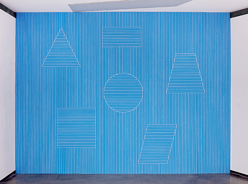 Sol Lewitt, Wall Drawing #332, dibujado por primera vez en mayo, 1980. Sala 2, Fundaci�n Proa. Fotograf�a: Marcelo Setton � 2019 The LeWitt Estate / Artists Rights Society (ARS), New York / SAVA, Buenos Aires.
Dibujos sobre pared (wall drawings)
por Sol Lewitt
Quería hacer una obra de arte todo lo bidimensional posible.
Parece más natural trabajar directamente sobre paredes que
hacer una construcción, trabajar sobre ella, y luego ponerla en
la pared.
Las propiedades físicas de la pared: altura, longitud, color,
material, y las condiciones e intrusiones arquitectónicas, son
parte necesaria de los dibujos sobre pared.
Diferentes clases de paredes hacen diferentes clases de
dibujos sobre pared.
Las imperfecciones en la superficie de la pared son
ocasionalmente aparentes después de terminado el dibujo.
Deben ser consideradas como parte del mismo.
La mejor superficie para dibujar es el yeso, la peor es el ladrillo,
pero ambas han sido utilizadas.
La mayoría de las paredes tienen agujeros, grietas,
protuberancias, manchas de grasa, están desniveladas, y
tienen variadas excentricidades arquitectónicas.
La ventaja de usar paredes es que el artista está a merced del
arquitecto.
El dibujo se hace con bastante suavidad, usando grafito
duro así las líneas devienen, lo más posible, una parte de la
superficie de la pared, visualmente.
Se use la pared entera o sólo una porción, las dimensiones
de la pared y su superficie tienen un efecto considerable en el
resultado.
Cuando se usan grandes paredes, el observador verá los
dibujos en secciones secuenciales, y no la pared como un
todo.
Distintos dibujantes producen líneas más oscuras o más claras,
más cercanas o alejadas. Mientras sean consistentes, no hay
preferencia.
Varias combinaciones de líneas negras producen diferentes
tonalidades; combinaciones de líneas de colores producen
diferentes colores.
Los cuatro tipos básicos de líneas rectas usados son verticales,
horizontales, diagonales de 45º de izquierda a derecha y de
derecha a izquierda.
Para dibujos de colores es preferible una pared blanca. Los
colores son amarillo, rojo, azul y negro, los mismos colores que
se usan en imprenta.
Cuando el dibujo sólo tiene líneas negras, la misma tonalidad
debe mantenerse a lo largo del plano a fines de mantener la
integridad de la superficie de la pared.
Un dibujo en tinta sobre papel acompaña al dibujo sobre pared.
Es hecho por el artista mientras que el dibujo sobre pared es
realizado por asistentes.
El dibujo en tinta es un plan pero no una reproducción del
dibujo de pared; el dibujo sobre pared tampoco es una
reproducción del dibujo en tinta. Son igualmente importantes.
Es posible considerar paredes a los lados de simples objetos
tridimensionales, y dibujar sobre ellos.
El dibujo sobre pared es una instalación permanente, hasta que
se destruye. Una vez hecho algo, no puede deshacerse.
Source:
Arts Magazine, vol.44, no. 6, New York, Abril 1970.
Sentences on Conceptual Art
by Sol Lewitt
Traducción Florencia Fragasso
- Conceptual artists are mystics rather than rationalists. They leap to conclusions that logic cannot reach.
- Rational judgements repeat rational judgements.
- Irrational judgements lead to new experience.
- Formal art is essentially rational.
- Irrational thoughts should be followed absolutely and logically.
- If the artist changes his mind midway through the execution of the piece he compromises the result and repeats past results.
- The artist's will is secondary to the process he initiates from idea to completion. His wilfulness may only be ego.
- When words such as painting and sculpture are used, they connote a whole tradition and imply a consequent acceptance of this tradition, thus placing limitations on the artist who would be reluctant to make art that goes beyond the limitations.
- The concept and idea are different. The former implies a general direction while the latter is the component. Ideas implement the concept.
- Ideas can be works of art; they are in a chain of development that may eventually find some form. All ideas need not be made physical.
- Ideas do not necessarily proceed in logical order. They may set one off in unexpected directions, but an idea must necessarily be completed in the mind before the next one is formed.
- For each work of art that becomes physical there are many variations that do not.
- A work of art may be understood as a conductor from the artist's mind to the viewer's. But it may never reach the viewer, or it may never leave the artist's mind.
- The words of one artist to another may induce an idea chain, if they share the same concept.
- Since no form is intrinsically superior to another, the artist may use any form, from an expression of words (written or spoken) to physical reality, equally.
- If words are used, and they proceed from ideas about art, then they are art and not literature; numbers are not mathematics.
- All ideas are art if they are concerned with art and fall within the conventions of art.
- One usually understands the art of the past by applying the convention of the present, thus misunderstanding the art of the past.
- The conventions of art are altered by works of art.
- Successful art changes our understanding of the conventions by altering our perceptions.
- Perception of ideas leads to new ideas.
- The artist cannot imagine his art, and cannot perceive it until it is complete.
- The artist may misperceive (understand it differently from the artist) a work of art but still be set off in his own chain of thought by that misconstrual.
- Perception is subjective.
- The artist may not necessarily understand his own art. His perception is neither better nor worse than that of others.
- An artist may perceive the art of others better than his own.
- The concept of a work of art may involve the matter of the piece or the process in which it is made.
- Once the idea of the piece is established in the artist's mind and the final form is decided, the process is carried out blindly. There are many side effects that the artist cannot imagine. These may be used as ideas for new works.
- The process is mechanical and should not be tampered with. It should run its course.
- There are many elements involved in a work of art. The most important are the most obvious.
- If an artist uses the same form in a group of works, and changes the material, one would assume the artist's concept involved the material.
- Banal ideas cannot be rescued by beautiful execution.
- It is difficult to bungle a good idea.
- When an artist learns his craft too well he makes slick art.
- These sentences comment on art, but are not art.
Source:
First published in 0-9 (New York), 1969, and Art-Language (England), May 1969
Bruce Nauman Interview (extracts)
by Willoughby Sharp
Willoughby Sharp:I know it often happens that you do certain things in one medium, then you do something similar in another medium. How does that come about? Is it because you cannot take a project further at a particular moment?
Bruce Nauman:Originally a lot of the things that turned into videotapes and films were performances. At the time no one was really interested in presenting them, so I made them into films. No one was interested in that either, so the film is really a record of the performance. After I had made a few films I changed to videotape, just because it was easier for me to get at the time. The camera work became a bit more important, although the camera was stationary in the first ones . . .
WS:Were these the films of bouncing balls?
BN:Yeah. The videotapes I did after those films were related, but the camera was often turned on its side or upside down or a wide angle lens was used for distortion. . . . As I became more aware of what happens in the recording medium I would make little alterations. Then I went back and did the performance, and after that . . .
WS:Which performance?
BN:The one at the Whitney during the “Anti-Illusion” show in ’69. I had already made a videotape of it, bouncing in the corner for an hour. At the Whitney the performance was by three people, instead of just myself, and after that I tried to make pieces where other people could be involved in the performance situation, individuals.
WS: Why did you find that desirable?
BN:It makes it possible for me to make a more . . . it’s difficult for me to perform, and it takes a long time for me to need to perform. And doing it once is enough. I wouldn’t want to do it the next day or for a week, or even do the same performance again. So if I can make a situation where someone else has to do what I would do, that is satisfactory. Quite a lot of these pieces have to do with creating a very strict kind of environment or situation so that even if the performer doesn’t know anything about me or the work that goes into the piece, he will still be able to do something similar to what I would do.
WS:Some of the works must be stimulated by a desire to experience particular kinds of situations. Just to see how they feel. Are you doing the work basically for yourself?
BN:Yes. It is going into the studio and doing whatever I’m interested in doing, and then trying to find a way to present it so that other people could do it too without having too much explanation.
WS:The concern for the body seems stronger now than when we did the Arts Magazine interview.
BN:Well, the first time I really talked to anybody about body awareness was in the summer of 1968. Meredith Monk was in San Francisco. She had thought about or seen some of my work and recognized it. An awareness of yourself comes from a certain amount of activity and you can’t get it from just thinking about yourself. You do exercises, you have certain kinds of awarenesses that you don’t have if you read books. So the films and some of the pieces that I did after that for videotapes were specifically about doing exercises in balance. I thought of them as dance problems without being a dancer, being interested in the kinds of tension that arise when you try to balance and can’t. Or do something for a long time and get tired. In one of those first films, the violin film (fig. 3.12), I played the violin as long as I could. I don’t know how to play the violin, so it was hard, playing on all four strings as fast as I could for as long as I could. I had ten minutes of film and ran about seven minutes of it before I got tired and had to stop and rest a little bit and then finish it.
Source:
First published in Avalanche 2 (Winter 1971): 2231. Reprinted with permission, Willoughby Sharp.
WS:But you could have gone on longer than the ten minutes?
BN:I would have had to stop and rest more often. My fingers got very tired and I couldn’t hold the violin any more.
WS:What kind of practice did you have for those films? Did you play the violin to see what sound you were going to get?
BN: I probably had the violin around for a month or two before I made the film.
WS: Did you get it because you were going to use it, or did it just come into your life?
BN: I think I bought it for about fifteen dollars. It just seemed like a thing to have. I play other instruments, but I never played the violin and during the period of time that I had it before the film I started diddling around with it.
WS:When did you decide that it might be nice to use it?
BN:Well, I started to think about it once I had the violin and I tried one or two things. One thing I was interested in was playing. . . . I wanted to set up a problem where it wouldn’t matter whether I knew how to play the violin or not. What I did was to play as fast as I could on all four strings with the violin tuned D.E.A.D (fig. 3.14). I thought it would just be a lot of noise, but it turned out to be musically very interesting. It is a very tense piece. The other idea I had was to play two notes very close together so that you could hear the beats in the harmonics. I did some tapes of that but I never filmed it. Or maybe I did film it while I was walking around the
WS: I saw most of these four films about a week ago at the School of Visual Arts—I liked them even better the second time I saw them. You made a simple, repetitive activity seem very important.
BN: I guess we talked about this before, about being an amateur and being able to do anything. If you really believe in what you’re doing and do it as well as you can, then there will be a certain amount of tension—if you are honestly getting tired, or if you are honestly trying to balance on one foot for a long time, there has to be a certain sympathetic response in someone who is watching you. It is a kind of body response, they feel that foot and that tension. But many things that you could do would be really boring, so it depends a lot on what you choose, how you set up the problem in the first place. Somehow you have to program it to be interesting.
[...]
Dan Graham Interview (extracts)
by Mike Metz
[…]
MM The objects of the technology seem to be a governing element. I’m thinking of the first pavilion pieces, where in effect you end up with a formal architectural structure. What predicated this move?
DG It had a lot of stages. There were video projects which took place within showcase windows that were between two glass office buildings and displayed picture windows of houses. So you have all the possibilities using real, urban and suburban architecture, consumer-oriented, showcase window architecture, office buildings—all of the elements that actually I later did with pavilions because the pavilions are mediating between traditional park/garden historical references to references of the city and urbanism. The change, if anything, was a change between making pieces that were camera obscuras which placed you almost inside the camera, and were referring to the optical system per se, to one’s showing the spectator, in terms of the perceptual process, as an audience, as a spectator, rather than as a work of art. The principles were the same, but these were the spectator in relation to materials commonly used in the city that had psychological and physiological properties.
MM Two-Way Mirror Cylinder Inside Cube and a Video Salon, is your most visible piece here in New York. What did you see as the relationship between the two parts, the video salon and the two-way mirror?
DG Heiner Friedrich’s original idea was to take one of the spaces downstairs and have a self-enclosed, discrete space, not framed by the city and outside distractions and definitely a non-museum type of space. Something like a church. A meditational space for the ideal work of art. My idea, obviously, was the opposite. I needed a public social space, a space that would be quasi-functional. So one aspect of the piece is both a coffee bar and a video salon. Six curators were hired to buy a library archive of videos in the areas of cartoon animation, music, architecture, performance and artist performance which would be permanently installed as a library. The piece and the space around it were designed to be a kind of bar or lounge area, a space for openings and social gatherings, and a space for performances.
MM So you really mean for the piece to be used.
DG Well, it’s part of the section of museums which are the most interesting architecturally: the bookshop, the coffee bar, social lounge area, romantic rendezvous area. It’s all to be a part of that.
MM A great Friday night pick up spot. I had heard that people were sleeping in Two Adjacent Pavilions during Documenta.
DG My students would sleep inside the pavilions with their sleeping bags. I designed this pavilion to fit about five to ten people inside. So the dimensions are always human. In a park situation, people are often lying down, as well as standing up and looking around. There’s always a reflection in my work between the work as an object in itself and the idea of people seeing themselves as perceiving and being perceived.
MM These pieces have the spectator at the center.
DG They’re designed around the perception of the spectator and the idea of the public in relation to the private person. The relationship of the spectator to a private artwork in a museum or gallery as somehow the subject of the art, which was the case in minimal and conceptual art.
MM So it’s moving the subject to the spectator and away from the object?
DG Well, my work became more involved with large public spaces, it shifted from one spectator to many spectators and not one public, but often two aspects of the same public.
MM Two-Way Mirror Cylinder Inside Cube and a Video Salon, uses mirrored surface as a device to move the spectator away from the object. How long have you used this surface as a means of perception?
DG We were speaking about the Body Press, which was the last of the double projections. That was related specifically to the body. But there’s also always a relationship in the double film pieces, between the outdoor surface of the body and the outdoor surface of the surrounding 360-degree environment, the two are mirroring each other. And the construction of the pieces has always involved a doubling or a mirror relationship. What was a structuralist procedure became first a physical device, and then performance. At that point, it seemed I could use video, including the video delay, in relationship to window glass and mirrors because video was a continuation of the renaissance perspective that was built into the mirror and the window, but extended it in many ways.
[…]
MM In a curious way, the two-way mirror is quite aggressive. What led to this?
DG They come out of work that came before. The first time I used two-way mirror glass was in a very simple video installation, and it attracted itself to me because this material had been used in psychological laboratories and was also used for surveillance. It was replacing, in many of the urban contexts, let’s say Toronto or Los Angeles, the sheer glass of the International style office building. The illusion of openness that the International style glass office building wanted to maintain was falling apart. The inner core of the city was becoming more dangerous, people were moving out of the city. The two-way mirror glass gave a certain amount of security in that people couldn’t look in during the day, but people inside could look out. And the opposite at night. Plus it was ecologically efficient, and it was definitely the new cliche of mediated social space on the inside of the city. For Documenta 7, I came up with the idea of doing an outdoor piece, but I wanted it to relate to the city, the suburbs, as well as the traditional park situation. It was to be used the way garden architecture and garden pavilions function in a normal large park. So I was picking up all of those things at the same time.
MM How do you see the difference in function between the pavilions and the pergolas? The pergolas seem to be much more relative to a planned garden environment.
DG You haven’t seen pavilions in the United States. In fact, they were just as garden oriented. The one from Muenster had a wooden roof, and a wood pole … it was in relation to an octagon, an 18th century palace. The layout for the grounds around the palace were octagonal. I was trying to coalesce different time periods.
MM This pavilion was made with mirrored glass.
DG Mirrored glass made it into a photo opportunity. And the idea of an amusement park, a funhouse situation creating kaleidoscopic space. And also a kind of fun division between parents and kids on the inside, and photographing parents and kids on the outside. It was very similar to these half-open music pavilions of the late 19th century, where there would be a bandshell on the inside of a large estate gazebo.
MM Psychologically more playful, less aggressive.
DG But the shows are normally in the summer, and based on tourism, which means families travelling in their automobiles, to specific locations where people go to see modern art in a country setting. And also they need to relax. And if they remain—let’s say in Muenster, most of the city is a large university city—so, these temporary buildings have to be used as young people would use them.
MM Speaking of young people, you’ve done two children’s pavilions.
DG Well, let’s see, the first one was circumstantial and was part of this very large exhibition in Ghent called Chambres d’Amis which had as its theme artists using interior private spaces of people who lived in Ghent. People responded to advertisements to allow their spaces to be used. This included doctors, lawyers, architects, social workers, teachers … People who were interested in the educational aspect of being temporary curators and guides, and also what would happen if their home and their private life became the subject of the artwork. I chose an architect because I liked the idea of doing work that was quasi-architecture for an architect. What turned out to be important was that I couldn’t do a work in the large-scale size that I had normally worked in, because it would have dwarfed his own architecture. Secondly, the area we chose in the back was a very rough area used by his kids as a playground. There was also a playground across the street used by neighborhood children. I wanted to keep that relationship to the playground across the street and build that into the piece. So what was originally going to be a small botanical garden finally became something more of a dollhouse, a children’s-size pavilion.
Source:
BOMB Magazine
MM Was street traffic allowed through the property?
DG Well, sure, that was the idea. In other words, the property itself became part of the museum show or, let’s say, it was related to these shows in public spaces inside the city. When I showed this video tape to Jeff Wall, he had the idea of designing a large-scale playground piece where he would do images of children very similar to the images of children he saw in the videotape. This became the Childrens Pavilion, and it was a completely different proposal which came about not because Jeff saw the original piece, but because he saw the television replication of the work. And of course, psychologically his identification with his children, his childhood. So I was operating from his interests and my own. At that time I was interested in underground architecture. For instance, one of the most salient playthings used by kids are these earth-mound mountains, that often have a hole in the top for kids to dive down into. The game has become a king of the mountain type thing except that they dive into the space. So my children’s pavilion was based around those conventions, and the conventions of the worship of children. The pantheon has an atrium hole in the top for the worship of the different gods whose images would be along the inside wall and illuminated by the sun overhead.
MM Virtually all your work deals with the spectator becoming aware of their own consciousness, a mediated view of themselves. That particular children’s pavilion is very much a media representation of how children are seen. It’s the establishment of stereotypes of children.
DG In Alteration of a Suburban House, you’re also dealing with the stereotyped idea of the suburban house after World War II as shown in magazines, the cliched prototype of a desirable, model house. The stereotype of a child probably comes from films; I think Jeff derived it from Spielberg films. We are both interested in Baroque paintings, the angels that appear on the ceilings in Baroque paintings. At the time I was doing Rock My Religion, where a teenager appears as an androgynous angel figure. The idea of children as angels comes from that sentimental idea of children that Jeff and I probably had concurrently. I also like the idea that on the outside, when you look down through the oculus you’re looking through a concave mirror image of yourself vastly enlarged, against the sky, the real sky on the outside opposed to the idealized sky in the photograph. As that sky changes, your image of yourself is changing. With a two-way mirror you’re seeing the idealized children below but you’re also seeing real children with their parents looking up through the oculus.
MM In your reading, what kind of affinities do you have to any philosophical or religious outlook?
DG At the time of the Childrens Pavilion it was a break with the anti-humanist liberalism of the minimal period and a return to, if you want, the United Nations of Humanism. It was the beginning of the ecology period and I was looking for an underground, earth oriented architecture.
MM I wanted to talk about those pieces that involve both indoors and outdoors. I’m thinking about Altered Two-Way Revolving door and Chamber with Sliding Door.
DG Again, these are all projects that were given to me. I designed that for an inaugurating exhibition to celebrate the World Financial Center. It was on the outside of a large lobby of the office building. There was an L-shaped corner in the building which was itself made out of two-way mirror glass. I filled it in to make a triangle, which was a natural extension to the architecture which allowed for a viewing area for the people on the inside.
MM The general passerby coming across the door would have thought it was a doorway.
DG Well, I don’t think after the opening of the exhibition, people went there for the work. The work blended into other semi-functional, semi-landscape, semi-artistic things that were part of the exhibit.
MM The fact that it wasn’t functional but looked like a doorway into the space …
DG But it did have a door that you could close and most people closed it. By closing the door you are creating a shelter for yourself. And you’re implicated in all the relationships. I think as soon as you close it off, you’re creating an architectural situation for yourself.
MM It’s curious. I was over there a couple of times after it was set up. Anyone who went in, closed the door and after a few moments, would come out looking sheepish.
DG It was small enough that generally it was for one person not a large group of people. And because it wasn’t labeled as art you didn’t have to look at it aesthetically.
MM More adventuresome but not intimidating.
DG You have to make a commitment in terms of taking time out. Most of the public/private pieces are to be walked past and not thought about. You’re not really stopped in your tracks. They’re really designed for semi-distracted observation.
MM You seem to be a move away from urban/corporate type works, with the use of the pergola, with its various plants, in a garden setting.
DG They’re public/private spaces for people to stroll through. The large, two-way mirror, hedge labyrinth piece has been built for a private collector as an extension of his garden and his hedge system. Another version of it was constructed for a gallery in London, in the center of Hyde Park. People stroll through it. You can see it if you’re driving through Hyde Park. It functions as garden space, as Renaissance, Baroque theme park.
MM Do you specify what plants are meant to go in those works. In other words, how much of a botanist are you?
DG Well, it depends on the actual situation, For example, when I was doing something in La Jolla, I was trying to match the plants they actually use as hedges. In fact, in La Jolla, I had to switch because there was a plant plague.
MM In La Jolla, a lot of people have hedges made out of jasmine which is fragrant and is associated with erotic gardens. Would you make a choice like that?
DG I was looking for something that was opaque when you looked at it from a distance but when you got close, had a lot of space between the flowers and the leaves. I wanted it to become more transparent as you got closer. Very similar to the mior glass. There was a vacillation between it being opaque, translucent, and transparent.
MM As with your other work, you are looking for a certain degree of anonymity.
DG I was looking for a contextual match. In other words, it’s related by context to a surrounding architecture or a plant. But it’s a hybrid between it and something else. It’s also emblematic of something that isn’t there but allegorically is suggested.
MM You said a number of years ago that you really wanted your work to leave out both the artist and the notion of artistic vision.
DG Well, I don’t know if there’s been the elimination of the aesthetic vision. These pieces are inherently aesthetic. It’s just that the aesthetic ideas are contained inside people’s perception of the piece, not the environment and the architecture.
Mike Metz is an artist who lives in Brooklyn and works in Staten Island.
Minimalismo en traducción
por Aimé Iglesias Lukin
Hacia fines de los años sesenta, la escena artística de Buenos Aires estaba en plena expansión, con tendencias de vanguardia que se superponían unas a otras en rápida ebullición y artistas mutando su estilo del informalismo al happening o del pop al arte de los medios en cuestión de meses. Como parte de dicho hervor, a partir de 1965 se puede registrar la aparición, en la obra de algunos artistas argentinos, de elementos que podían alinearse formalmente con una nueva tendencia escultórica norteamericana, luego conocida como “minimalismo”. Dichos signos no pueden, sin embargo, pensarse simplemente como un proceso de influencia y translación: las estructuras primarias en Argentina se alineaban a partir de otra serie de herencias intelectuales, y derivarían en distintos resultados. Dos ejemplos de este “minimalismo en traducción” nos permiten entender la continuidad y ruptura de las experiencias argentinas en relación con el movimiento minimalista norteamericano. El primero es la exhibición “Estructuras Primarias II”, un caso único de “traducción” expositiva en el que Jorge Glusberg homenajeaba la recientemente abierta muestra consagratoria del minimalismo americano Primary Structures, y bajo esa operación curatorial y nominal intentaba asociar la obra de un grupo de artistas locales de vanguardia a la corriente del norte. El segundo es la evolución del trabajo de Alejandro Puente, cuya obra fue leída en los tardíos sesenta como minimalista por el crítico Sam Hunter y el artista Sol LeWitt. Esta adscripción, probablemente no buscada por el propio Puente, terminó llevándolo a Nueva York, donde su obra y pensamiento estético mutarían en forma inesperada.
La rápida aparición de terminologías como “minimalismo” en la historia del arte argentino se explica también a partir del fuerte impulso internacionalista de muchos de los gestores culturales que lideraron la vanguardia local durante el período, y por una fluida red de contactos con el país del norte.
Como fue expuesto en la investigación coordinada por Rodrigo Alonso para la exhibición “Imán: Nueva York”, presentada en 2009 en Fundación Proa, la red de intercambios entre Estados Unidos y Argentina creció exponencialmente durante los años sesenta, apoyada por iniciativas privadas y estatales norteamericanas en el marco del programa de diplomacia cultural hemisférica dictado por la política de Alianza para el Progreso, determinada en 1961 por John F. Kennedy, con el objetivo de frenar el avance del comunismo en la región.1 Específicamente en el marco cultural, estas políticas se manifestaron en un sistema de apoyo e intercambio con artistas jóvenes hispanoamericanos bajo una idea bastante simple, que terminó siendo, en cierta 1 Alonso, Rodrigo, Imán, Nueva York: Arte argentino de los años 60, Buenos Aires, Fundación Proa, 2010; asimismo, ver Fox, Claire F., Making Art Panamerican: Cultural Policy and the Cold War, Minneapolis, University of Minnesota Press, 2013; Giunta, Andrea, Vanguardia, internacionalismo y política: arte argentino en los añossesenta, Buenos Aires, Paidós, 2001. medida, eficaz: llevar a los creadores de las nuevas generaciones a los Estados Unidos para que se reconocieran en el éxito de las reglas del juego de la economía liberal.
Dicha política fue organizada mediante alianzas institucionales y se materializó en una serie de exhibiciones itinerantes en ambos países, como New Directions of Artfrom South America (Nuevas direcciones del arte de Sudamérica) (1962) y “De Cézanne a Miró” (1968). El intercambio de agentes culturales fue clave, particularmente en dirección norte-sur, e incluyó el viaje de artistas como Sol LeWitt, así como de críticos y curadores como Alfred Barr, Clement Greenberg y Lucy Lippard para actuar de jurados en premios como la Bienal Americana de Arte en Córdoba y el Premio Internacional Di Tella en Buenos Aires. En dirección contraria, con la ayuda de dichos contactos y mediante becas como la Guggenheim, muchos artistas argentinos viajaron a Nueva York a probar suerte en el nuevo centro del arte mundial. Como resalta Rodrigo Alonso en “Imán”, el viaje a Nueva York se diferenciaba en objetivos de su antecedente parisino de la primera mitad del siglo XX, cuando se pensaba en el viaje a Europa como una instancia formativa en la que se absorberían ideas de vanguardia para luego regresar y constituir movimientos modernos en el país de origen. Para los artistas de los sesenta, el viaje era un intento de inmersión, sin fecha ni intención de regreso confirmadas, porque estaban alentados por la idea, antes impensable, de la posibilidad del éxito en el exterior.2
En este clima de optimismo internacionalista y fluidez estilística, entre 1965 y 1967 una serie de exhibiciones en instituciones como el Museo Nacional de Bellas Artes y el Instituto Di Tella, así como en galerías comerciales de vanguardia, dan cuenta de la aparición de un cierto “minimalismo” argentino. En particular, en septiembre de 1967, en el marco de la “Semana del arte avanzado en la Argentina”, se observó la primacía de la estética de estructuras primarias en la exhibición “Rosario 67” en el Museo de Arte Moderno de Buenos Aires, y la anteriormente mencionada “Estructuras Primarias II”.3
“Estructuras Primarias II” tuvo lugar entre el 27 de septiembre y el 27 de octubre de 1967 en la Sociedad Hebraica, en el barrio de Balvanera. La exhibición fue organizada por Jorge Glusberg e incluía piezas de César Ambrosini, Rodolfo Ramón Azaro, Miguel Ángel Bengochea, Oscar Bony, Aldo Bortolotti, Graciela Carnevale, Jorge Luis Carballa, Noemí Escandell, Eduardo Favario, Fernández Bonina, María Mercedes Estévez, Carlos Gatti, David Lamelas, Lía Maisonnave, Gabriel Messil, Oscar Palacio, Margarita Paksa, Roberto Puzzolo, Juan Pablo Renzi, Osvaldo Romberg y Antonio Trotta; reunidas por el curador bajo la consigna de que eran piezas cercanas al lineamiento formal del minimalismo consagrado en Estados Unidos.
Como su nombre lo indica, la exhibición fue concebida como saga u homenaje, acaso una traducción de Primary Structures: Younger American and British Sculptors, la exhibición curada por Kynaston McShine el año anterior en el Jewish Museum de Nueva York y que solidificó al minimalismo como una nueva propuesta estética que pretendía redefinir el lugar de la escultura y del arte.
En el catálogo de la exhibición, Glusberg declara explícitamente sus intenciones cuando dice que las obras presentadas “crean situaciones comunes a lo que en mayo de 1965 [sic] presentaron en el Museo Judío de Nueva York cuarenta y dos artistas ingleses y americanos”.5 Dicha declaración, sumada a la repetición del título y el hecho de que Glusberg también organizó su versión en una institución relacionada con la comunidad judía, lleva a pensar en “Estructuras Primarias II” no simplemente como homenaje, sino como un intento de traducción literal y asociación estilística al nuevo movimiento de moda en Estados Unidos. Mediante dicha operación, las obras presentadas y la propuesta curatorial de Glusberg transcendían las indagaciones estéticas de los participantes para insertarlos en un debate sobre el futuro del arte de dimensiones continentales y espíritu cosmopolita, para ampliar la oferta del mercado interno y abrir puertas para su expansión internacional.
Primary Structures se había exhibido en el Jewish Museum de Nueva York entre el 27 de abril y el 12 de junio de 1966 (no en 1965, como erróneamente se publicó en el texto de Glusberg). Presentaba obras recientes de 42 artistas de Nueva York, California y Gran Bretaña. El título de la exhibición, sugerido por Lucy Lippard, daba cuenta de un nuevo tipo de objeto, las estructuras primarias, que radicalizaban la idea de abstracción, y así evitaban cualquier referencia figurativa y proponían formas autosuficientes con nuevos medios y materiales. Si bien la exhibición era mucho más diversa en estilo, fueron las piezas de artistas como Carl Andre, Dan Flavin, Donald Judd, Sol LeWitt, Robert Smithson y Robert Morris las que dieron fama a la exhibición y la convirtieron en la presentación en sociedad del minimalismo, una nueva tendencia estilística caracterizada por formas abstractas, composiciones autocontenidas y el uso de una estética y materiales industriales.6
Con “Estructuras Primarias II”, Glusberg inauguraba una carrera dedicada a la difusión del arte latinoamericano en el mundo y al intercambio entre las Américas y Europa que lo confirmarían como un gestor y curador que asumía su rol en el mercado local como el de promotor de las tendencias internacionales en Argentina y exportador de la vanguardia propia a los mercados internacionales. En dicho rol de traficante de ideas, el trabajo de Glusberg se encuentra, desde este primer proyecto, con los obstáculos previstos por un intercambio que se fantaseaba como de libre comercio, pero que sin embargo estaba limitado por la realpolitik de la inequidad transaccional entre centro y periferia.7
Un texto del crítico austríaco-francés Otto Hahn abría el catálogo de “Estructuras Primarias II” resaltando el objetivo global de la muestra con la frase "Año tras año, Argentina, exportadora de artistas, manifiesta su vitalidad". Dentro de la explosiva creatividad de la escena argentina, dice Hahn mediante una metáfora volcánica, algunos artistas se disiparían en humo y otros se transforman en estrellas fugaces que caerían en Nueva York, París o Londres. El problema, resaltaba Hahn, era que a pesar de la “mitología modernista” de los jets y los Boeing, Argentina seguía siendo “ese país del fin del mundo”.8 La posibilidad de circulación estaba, entonces, limitada por el mapa y el kilometraje.
Como planteó Walter Benjamin en su célebre texto “La tarea del traductor”, toda traducción conlleva una distancia del original, e implica, necesariamente, una interpretación, una transacción, e, incluso, podríamos decir, apelando a la vieja expresión italiana “traduttore traditore”, una traición.9 En ese sentido, entender “Estructuras Primarias II” como traducción permite evaluar el gesto de continuidad, pero también de ruptura, entre el homenaje y la exhibición original
Si bien puede leerse al esfuerzo curatorial de Glusberg como una búsqueda de adscripción y traducción; era distinto el objetivo de los artistas allí expuestos. Elsinusoide, de Oscar Bony, que había ganado unos meses antes el Premio Ver y Estimar, escapaba, como remarca Davis, a la lógica autocontenida y puramente abstracta del minimalismo tradicional mediante sus formas dinámicas y su similitud a una serpiente.10 Obras como Grados de libertad en un espacio real de Juan Pablo Renzi sumaba, mediante su título, un mensaje no solo conceptual, sino claramente político, a la estructura cúbica de tubos de aluminio en que consistía la pieza. La obra presentada por David Lamelas, Situación de tres horas (una versión de la célebre Situación de tiempo, presentada al mismo tiempo en “Experiencias 67”) trascendía las propuestas del minimalismo y proponía una investigación mediática y un modelo conceptual al presentar televisores mal sintonizados que emitían ruido electromagnético como modelo para la “nueva escultura” que presentaba la exhibición. Estos ejemplos demuestran que, si bien como exhibición “Estructuras Primarias II” respondía a la intención de Glusberg de encontrar una continuidad con el modelo norteamericano, los artistas allí reunidos tenían intereses y procesos propios, y su alineación con el minimalismo fue estratégica, circunstancial y temporaria.
El caso de Alejandro Puente es también demostrativo del desarrollo independiente de las estructuras primarias en Argentina, y ejemplar de los distintos resultados en que derivaría. Hacia comienzos de los sesenta, el artista platense era parte del Grupo Sí, un colectivo afiliado al informalismo y la geometría sensible que exhibiría en 1961 en el Museo Nacional de Bellas Artes. En 1964, Puente mostraría junto con César Paternosto en la Galería Lirolay, lo que generó el interés de Samuel Paz, el director del Instituto Torcuato Di Tella, quien les presentaría a Jorge Romero Brest, director del Centro de Artes Visuales del ITDT, y organizaría una presentación de sus trabajos al célebre crítico de arte Clement Greenberg, quien visitaba la ciudad como jurado de un premio.
Desde mediados de los años sesenta, la obra de Puente empezaba a explorar modos de quebrar los límites impuestos por el marco pictórico e involucrar al espectador, como puede verse en Berenjenal, presentada en el Premio di Tella de 1966.11 Viendo dicha exhibición, Sam Hunter, director del Jewish Museum ―que estaba en Argentina como jurado de la III Bienal Americana de Arte en Córdoba―, le dijo a Puente que sus obras podrían haber sido incluidas en Primary Structures, y le sugirió aplicar a una beca Guggenheim para viajar a Nueva York, la cual ganaría al año siguiente.12
Antes de partir a Nueva York a fines de 1967, Puente participó de dos exhibiciones claves en el desarrollo de las vanguardias locales: “Más allá de la geometría”, curada por Jorge Romero Brest en el Centro de Artes Visuales del ITDT y “Visión elemental”, organizada como parte de la “Semana del Arte Avanzado” en el Museo Nacional de Bellas Artes. En esta última, Puente presentó la evolución de su experimentación con pinturas que invadían el espacio del espectador: Cubo transitableera una estructura cúbica penetrable compuesta mediante la yuxtaposición de cuatro paneles de madera en forma de L. Creados bajo una proporción 2:1 y pintados con los colores primarios, los paneles se sostenían entre sí gracias a sutiles engranajes y a la ley de gravedad, y generaban una presencia tan sólida y pesada como frágil y etérea. La pieza fue vista por Sol LeWitt, quien estaba en Buenos Aires para participar del Premio Internacional Torcuato Di Tella, quien, interesado por la pieza, pidió conocer a Puente. Según relata el artista platense, en esa primera reunión, LeWitt se mostró muy identificado con su uso de módulos predeterminados, pero cuestionó la importancia dada a los colores en su estructura. La conversación se retomaría meses después en Nueva York, ciudad en la que se volverían amigos. Puente recuerda haber defendido el uso del color no como elemento expresivo de la individualidad del artista, sino como parte de una investigación conceptual sobre el color como sistema predeterminado. LeWitt, asimismo, cuestionaba a Puente por el uso de técnicas de carpintería básica, y le sugería que encargara sus obras para fabricación industrial. La respuesta de Puente, producto de la picardía hispanoamericana, pero conceptualmente muy reveladora, fue 11 Mi investigación sobre el período de Alejandro Puente en Nueva York fue publicada en forma más extendida en Iglesias Lukin, Aimé, “Alejandro Puente: Color Systems in between Cultures”, Review: Literature and Arts of theAmericas, 47(2), 3 de julio de 2014, pp. 224–230, https://doi.org/10.1080/08905762.2014.956587. 12 Alonso, op cit., p. 230. que trabajaba con dichos materiales y de esa forma por ser latinoamericano y no contar con los recursos para que otros hicieran su trabajo por él. Más allá de la obvia diferencia económica de cada contexto, lo que la respuesta de Puente denota es un interés por la factura y la materialidad mayor a la de LeWitt –―la afirmación del proceso como parte de la obra, cuya búsqueda estética se focalizaba en la desmaterialización de la pieza creando obras-instrucciones―.13
De hecho, este interés por la materialidad se enfatizaría y encontraría una justificación conceptual y espiritual durante la estadía de Puente en Nueva York. Inspirado por una exhibición de arte precolombino que vio en el Metropolitan Museum of Art de Nueva York en 1967, Puente declara haber descubierto allí las raíces andinas de la abstracción en el arte. Para Puente, dicha teoría demostraba que su investigación estética y la de otros artistas abstractos latinoamericanos no era derivativa de Europa, sino propia de su identidad regional. Así, la obra de Puente durante la primera mitad de los años setenta mantendría la investigación conceptual sobre sistemas de color y comunicación, pero enfatizaría el uso del textil, la trama, e, incluso, de la plumaria. Su obra se volvió más matérica y organicista que nunca, marcándolo cual marca una fuerte diferencia con el conceptualismo norteamericano. Lo fascinante del caso de Puente es, precisamente, que su estadía en Nueva York forzó su búsqueda creativa e identitaria hacia un camino completamente inverso al que sugería la gran metrópolis, volteando su búsqueda estética e identitaria de regreso a su cultural local.14
A pesar de las similitudes formales con la obra de los minimalistas norteamericanos, las estructuras primarias de la Argentina se desarrollaron bajo la herencia cultural de las tradiciones de vanguardia locales, en particular, desde la búsqueda de trascender las limitaciones del marco pictórico iniciadas por el Arte Concreto y Madí. Asimismo, las estructuras primarias no llegaron a constituirse en un movimiento, a pesar del intento de Glusberg con su exhibición homenaje, sino que para la mayoría de los artistas fue una breve etapa en el desarrollo estilístico hacia otras vertientes. Para artistas como Puente fue un modo de pasar a un conceptualismo que no abandonaría sus cualidades matéricas, tal como puede testimoniarse en la obra que desarrolla al llegar a Nueva York. En la obra de artistas como Margarita Paksa y David Lamelas serían un paso hacia la desmaterialización del objeto artístico y el trabajo con nuevos medios.
En su texto de 1923, Walter Benjamin aclara que el rol de la traducción no es transmitir la exactitud de la lengua, sino la poética de la obra original, y que la literalidad puede ser incluso problemática: La fidelidad en la traducción de la palabra aislada casi nunca transmite por completo el sentido del original. Porque el sentido, respecto del significado poético que tiene para el original, no se reduce a lo designado, sino que lo adquiere precisamente en la forma en que lo designado está sometido a la manera de designar de la palabra determinada.15
En su intento de traducción literal de Primary Structures, Glusberg pretendía promocionar la producción local como en sintonía con las tendencias norteamericanas. Si bien forzaba la interpretación de algunas de las obras al clasificarlas como estructuras primarias, su intención trascendía la tarea de adjetivación de esos objetos en pos de un objetivo mayor: dar espacio a la obra de estos artistas, y a su labor como curador y gestor en el mercado internacional de las ideas. En ese sentido, y ateniéndose a los objetivos que él buscaba, se puede leer la traducción instrumental de Glusberg también como una traición poética.
Como artista migrante en la gran metrópoli mientras aprende un nuevo lenguaje, Puente se decidiría por una traducción-interpretación mestiza de la abstracción y el minimalismo que habilitaría e, incluso, reforzaría su identidad cultural como latinoamericano. Quizás no hay mejor manera de entender su apelación a la cultura precolombina, una cultura con la cual no estaba necesariamente afiliado en origen, como una forma de traducción poética de su identidad entre culturas.
Cada región tiene un contexto que determina una o varias poéticas, sin el cual las obras aisladas no pueden comprenderse, y las estructuras primarias de la Argentina respondían a una historia cultural y a unas necesidades estilísticas distintas de las del minimalismo de los Estados Unidos, ergo la imposibilidad de una comparación que no contemple la transacción. En sus traiciones, el minimalismo en la Argentina fue, entonces, una verdadera traducción.
-
Sol Lewitt– Wall Drawings
Presentada en Fundación Proa entre el 1.o de diciembre de 2001 y el 1.o de marzo de 2002, la exhibición Sol LeWitt-Wall Drawings presentó seis dibujos de pared del artista, ejecutados durante seis semanas por diez artistas locales bajo la dirección de Anthony Sansotta, miembro del estudio de LeWitt, siguiendo las instrucciones diseñadas por LeWitt para el edificio de Proa y enviadas por fax para su realización. Los seis murales estaban realizados con pintura acrílica en vibrantes colores primarios y complementarios. Cada uno presentaba una composición geométrica particular, creada a partir de módulos predeterminados, en tamaño monumental. Dado el carácter conceptual de la obra, los murales fueron cubiertos tras finalizar la exhibición. En un artículo del diario Clarín que reseñaba la exhibición, Sansotta declaraba: "Yo entiendo lo que quiere LeWitt, soy un traductor", y agregaba "LeWitt dijo que quería que los colores fueran lo más planos posible. La idea es no darle al gesto un significado, lograr un resultado objetivo. La subjetividad entrará en el modo en que cada uno interprete lo que ve".
La subjetividad del artista entraría, entonces, solo el día de la inauguración, cuando por primera vez vio los murales.
-
Dan Flavin
Organizada por el Dia Art Foundation y curada por su director Michael Govan, DanFlavin se presentó en Fundación Proa entre el 5 de octubre y el 30 de noviembre de 1998. La exhibición retrospectiva presentó una selección de obras lumínicas del artista creadas entre 1963 y 1980: piezas compuestas de tubos fluorescentes que buscaban dar color al aire y generar una expectación dinámica donde el visitante perciba distintos estímulos a medida que recorre, atraviesa y penetra la luz emitida por las obras. Influido por el constructivismo y, en especial, por Tatlin y Malévich, las obras de Flavin hacen uso del espacio en que se exhiben y enfatizan la arquitectura de Proa mediante la colocación de obras en los cantos de paredes y escaleras, y mediante la expansión de la luz de las obras más allá de las salas expositivas. La exhibición incluyó además una sala completa con ejemplos de la icónica serieMonuments for Vladimir Tatlin(Monumentos para Vladimir Tatlin), de 1964, en las que Flavin homenajea al ruso y a su revolucionario proyecto escultórico Monumento a la Tercera Internacional (1919- 1920). La exhibición incluía además The Diagonal of May 25 (to Constantin Brancusi),1963, 1963 [La diagonal del 25 de mayo (para Constatin Brancusi)], el primer trabajo de neón fluorescente de Flavin, realizado en 1963.
–
1 Alonso, Rodrigo,Imán, Nueva York: Arte argentino de los años 60, Buenos Aires, Fundación Proa, 2010; asimismo, ver Fox, Claire F., Making Art Panamerican: Cultural Policy and the Cold War, Minneapolis, University of Minnesota Press, 2013; Giunta, Andrea, Vanguardia, internacionalismo y política: arte argentino en los añossesenta, Buenos Aires, Paidós, 2001.
2 Alonso, Imán, Nueva York, 16.
3 La semana del arte avanzado consistió en una serie de actividades organizadas por el Instituto Di Tella en distintas instituciones de la ciudad. Ver Longoni, Ana y Mestman, Mariano Del Di Tella a “Tucumán Arde” vanguardiaartística y política en el 68 argentino, Buenos Aires, Eudeba, 2008; Davis, Fernando, “El conceptualismo como categoría táctica”, Revista Ramona, n.o 82, 2008.
4 En clara apelación de autoridad, Glusberg incluye en las páginas de apertura como "invitados especiales" a Alan Solomon, exdirector del Jewish Museum; E. De Wilder, director del Stedelijk Museum de Ámsterdam, y Jorge Romero Brest, director del Centro de Artes Visuales del Instituto Torcuato Di Tella (ITDT). Obra presentada en Estructuras Primarias II (Sociedad Hebraica Argentina).
5 Glusberg, Jorge (ed.), Estructuras primarias II, Buenos Aires, Sociedad Hebraica Argentina, 1967.
6 Además de los artistas mencionados, la exhibición incluía piezas de Richard Artschwager, Judy Cohen Gerowitz (Judy Chicago), Ellsworth Kelly, Robert Grosvenor y Anne Truitt, así como los británicos Anthony Caro y Tony Smith. Para una historia crítica de Primary Structures II, ver Meyer, “A Tour of Primary Structures” Minimalism(London; New York, NY: Phaidon, 2010), 13–30. Bruce Altshuler, James, The Avant-Garde in Exhibition New Artin the 20th Century, Berkeley, University of California Press, 1998, pp. 220–35. Altshuler, Bruce, Biennials andbeyond: Exhibitions That Made Art History. Volume II, Volume II, London; New York, Phaidon, 2013, pp. 51–62.
7 Véase, por ejemplo, el posicionamiento crítico de Fernando Davis con respecto al rol de las estructuras primarias en el marco de los experimentos vanguardistas de 1967 en “El conceptualismo como categoría táctica”, op. cit.
8 Hahn, Otto, “Para el catálogo de ‘Estructuras Primarias II’”, Glusberg, op. cit..
9 Benjamin, Walter, “La tarea del traductor”, en Dámaso López García (ed.) Teorías de la traducción: antología detextos, Cuenca, Universidad de Castilla-La Mancha, 1996, pp. 335–347.
10 Davis, op. cit, p. 35.
11 Mi investigación sobre el período de Alejandro Puente en Nueva York fue publicada en forma más extendida en Iglesias Lukin, Aimé, “Alejandro Puente: Color Systems in between Cultures”, Review: Literature and Arts of theAmericas, 47(2), 3 de julio de 2014, pp. 224–230, https://doi.org/10.1080/08905762.2014.956587.
12 Alonso, op cit., p. 230
13 Ídem, p. 229.
14 Ideas similares ya habían sido desarrolladas por Torres García y serían formuladas en forma sistemática en la obra teórica de su amigo César Paternosto. Ver, por ejemplo, Paternosto, César, The Stone and the Thread: Andean Rootsof Abstract Art, Austin, University of Texas Press, 1996.
15 Benjamin,op. cit., p. 343.